File:Piechart.svg

Size of this PNG preview of this SVG file: 703 × 321 pixels. Other resolutions: 320 × 146 pixels | 640 × 292 pixels | 800 × 365 pixels | 1,024 × 468 pixels | 1,280 × 584 pixels.
Original file (SVG file, nominally 703 × 321 pixels, file size: 13 KB)
| This is a file from the Wikimedia Commons. The description on its description page there is shown below.
|
Summary
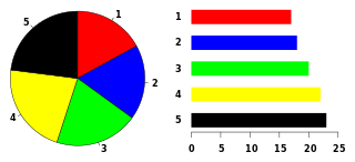
Example of a pie chart, along with a bar plot showing the same data and indicating that the pie chart is not the best possible chart for this particular dataset.
The graphic was created by User:Schutz for Wikipedia on 27 December 2006, using the R statistical project. The program that generated the graphic is given below; the data and the idea are from w:Image:PieCompare.png by w:User:Chrispounds. The graph was exported in postscript format, converted to SVG using the pstoedit command, and the layout was slightly modified using Inkscape before upload.
Licensing
| I, the copyright holder of this work, release this work into the public domain. This applies worldwide. In some countries this may not be legally possible; if so: I grant anyone the right to use this work for any purpose, without any conditions, unless such conditions are required by law. |
File history
Click on a date/time to view the file as it appeared at that time.
| Date/Time | Dimensions | User | Comment | |
|---|---|---|---|---|
| current | 04:39, 1 January 2007 | 703 × 321 (13 KB) | Schutz |
File usage
The following page uses this file: