File:Active COVID-19 cases in Montenegro.png
No higher resolution available.
Active_COVID-19_cases_in_Montenegro.png (529 × 587 pixels, file size: 55 KB, MIME type: image/png)
| This is a file from the Wikimedia Commons. The description on its description page there is shown below.
|
Summary
| Description |
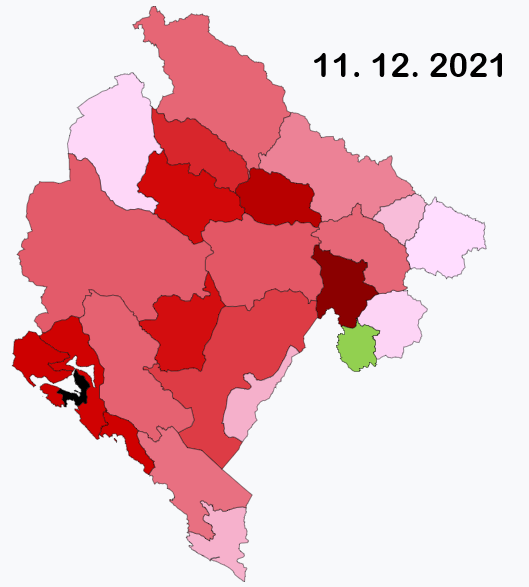
English: This map shows active COVID-19 cases per 100,000 inhabitants by municipality. If the map gets darker, it doesn't actually mean the situation is worsening, but it means there are smaller differences in active cases between municipalities with biggest and lowest number. If the map gets lighter, it means there is a big difference between municipality with highest number of active cases and other municipalities; this often happens if a hotspot appears in some of the municipalities (there is always one municipality black). If a municipality is green, it means there are currently no active cases. Because of small population in most of the municipalities, this map looks different with every daily update and the colours can change very quickly. Data used to create the map come from official Montenegrin COVID-19 statistics page – https://www.covidodgovor.me/me/statistika |
| Date | |
| Source | Own work |
| Author | Moson81 |
Licensing
I, the copyright holder of this work, hereby publish it under the following license:
This file is licensed under the Creative Commons Attribution-Share Alike 4.0 International license.
- You are free:
- to share – to copy, distribute and transmit the work
- to remix – to adapt the work
- Under the following conditions:
- attribution – You must give appropriate credit, provide a link to the license, and indicate if changes were made. You may do so in any reasonable manner, but not in any way that suggests the licensor endorses you or your use.
- share alike – If you remix, transform, or build upon the material, you must distribute your contributions under the same or compatible license as the original.
File history
Click on a date/time to view the file as it appeared at that time.
| Date/Time | Dimensions | User | Comment | |
|---|---|---|---|---|
| current | 16:53, 11 December 2021 | 529 × 587 (55 KB) | Moson81 | update 11. 12. 2021 |
File usage
The following page uses this file: