Legibility

Black letter in a Latin Bible of 1407 AD, in Malmesbury Abbey, Wiltshire. Most people find this difficult to read
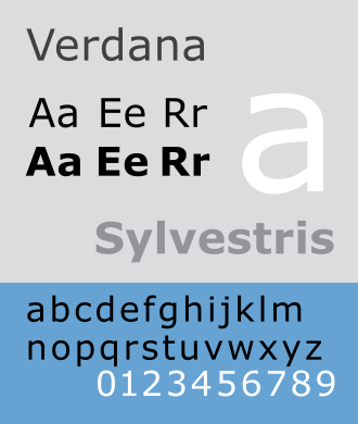
Legibility is the degree to which writing can be seen and read.[1] Each glyph (individual character) in text has a shape we recognize in reading. The complete set of letters and symbols in a design is called a font (or fount). The choice of font is therefore the first thing which affects legibility.
A second factor in legibility is the setting, the way the type is used in practice. This includes line length, line spacing ("leading"), justification, typestyle, kerning, tracking, point size, etc.[2][3]
References
- ↑ Tinker M.A. 1963. Legibility of print. Iowa State University Press. ISBN 0-8138-2450-8
- ↑ Williamson, Hugh 1956. Methods of book design: the practice of an industrial craft. Oxford University Press
- ↑ Aldrich-Ruenzel N. & Fennell J. 1991. Designer's guide to typography. Oxford: Phaidon. ISBN 0-7148-2706-1
