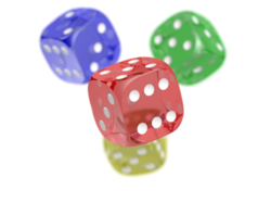
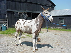
Template:Multiple image/doc
| This is a documentation subpage for Template:Multiple image. It contains usage information, categories and other content that is not part of the original template page. |
| This template uses Lua: |
This template creates a box containing between two and ten images, arranged either vertically or horizontally and with captions for the entire box or per image.
With the appropriate choice of parameters, the template can automatically resize images to a given total width with each image having the same height.
Be aware that this template does not respect users' default image size preferences. (Wikipedia:Image use policy states: "Except with very good reason, do not use
)
px"... "which forces a fixed image width. In most cases upright=scaling factor should be used, thereby respecting the user's base preference (which may have been selected for that user's particular devices)."
If image size parameters are omitted, this template sets all images at 200px wide, regardless of whether the reader has set a preference for some other default image width. This causes multiple images to look out of scale to the other images in an article.
Syntax and parameters
Provide height[n] and total_width parameters to obtain automatic resizing. Note the different meanings of the width[n] parameters with vs. without automatic resizing.
- No automatic resizing of all images to the same height
- <source lang="xml">
</source>
- Automatic resizing of all images to the same height and to a given total width
- <source lang="xml">
</source>
| Parameter | Description |
|---|---|
| align | right (default), left, center |
| direction | horizontal (default), vertical |
| background color | To set the background color of the box in which the images appear. |
| header_background | |
| header_align | center (default), left, right |
| header | |
| width | Use to set the same width for each image (i.e. overrides any width[n] below). Do not include if different image widths intended, including if images are to be resized to a fixed total width. |
| total_width | Use to scale the images to the same height and this total width. Do not use both total_width and width. |
| image[n] | (where [n] = 1 to 10) Filename of [n]th image. |
| width[n] | (as above) Two meanings: (1) The width (in pixels, integer, omit "px") of [n]th image. Overridden by width (if set). (2) The full width of the original [n]th image if total_width is given in order to resize all images to the same height and a given total width. |
| height[n] | (as above) The full height of the original [n]th image if total_width is given in order to resize all images to the same height and a given total width. Ignored otherwise. |
| alt[n] | (as above) Alt description for [n]th image. |
| link[n] | (as above) To specify the page to which the [n]th image is linked (i.e. the page that is loaded when the image is clicked). If set as empty (e.g. ...|alt1=... |link1= |caption1=...), linking is disabled (even to the standard Wikipedia image description page); consider WP:ALT. Note: This parameter must not be used with images that have been given free licenses (such as the GDFL or a free CC license) as these licenses require images to be linked to a declaration of the license under which they are being used. |
| thumbtime[n] | (as above) When using Ogg Theora files, sets the time within the video that is used for the initial display. This is either a number of seconds or hours:minutes:seconds; see commons:Commons:Video#Setting a video thumbnail image. |
| caption[n] | (as above) Caption for the [n]th image. |
| caption_align | left (default), center, right |
| footer_background | |
| footer_align | left (default), center, right |
| footer | Caption that spans the entire box, as opposed to individual images. Avoid "left" and "right" if possible, since mobile devices may display the images vertically. |
Examples
{{multiple image
 | width = 60
 | image1 = Yellow card.svg
 | alt1 = Yellow cartouche
 | image2 = Red card.svg
 | alt2 = Red cartouche
 | footer = Players are cautioned with a yellow card and sent off with a red card.
}}
{{multiple image
 | align = left
 | direction = vertical
 | width = 200
 | header = [[Portable Network Graphics|PNG]] transparency demonstration
 | image1 = PNG transparency demonstration 1.png
 | alt1 = Colored dice with white background
 | caption1 = A PNG image with an 8-bit transparency layer...
 | image2 = PNG transparency demonstration 2.png
 | alt2 = Colored dice with checkered background
 | caption2 = ...here overlaying a checkered background.
}}
{{multiple image
 | width = 60
 | image1=Ribbon numeral 2.png | alt1=2
 | image2=Ribbon numeral 3.png | alt2=3
 | image3=Ribbon numeral 4.png | alt3=4
 | footer = When a user has many of one type of [[WP:BARN|barnstar]], they can represent them with [[WP:RIBBON|ribbons]] and these numerals to indicate the count.
}}
With background color
<source lang="moin" style="overflow:auto;">
</source>
With links (link[n])
<source lang="moin" style="overflow:auto;">
</source>
Using direction
By default, the images the template presents are displayed horizontally, as a row (see left; equivalent to setting |direction=horizontal). To display them vertically, i.e. as a column, set |direction=vertical (see right).
On mobile devices some images may always be displayed vertically if the total width is larger than around 320.
To match image heights
- Decide on a total width for all the images, say 320px
- Set the total width using
|total_width=
{{multiple image
 | align = right
 | total_width = 320

 | image1 = Donkey 1 arp 750px.jpg
 | alt1 = A donkey
 | caption1 = Rectangular image of a donkey, originally 536 pixels high.

 | image2 = Rainbow_trout.png
 | alt2 = A trout
 | caption2 = Square image of a trout, originally 300 pixels high.

 | footer = Both images have been rendered with the same height, and a total width of 320px
}}
The aspect ratio of each image is automatically retrieved from the File metadata. You can override the native width and height values by
- Examining the individual image pages to obtain the full resolution. For example:
- File:Donkey 1 arp 750px.jpg shows "Donkey_1_arp_750px.jpg (750 × 536 pixels, file size: 125 KB, MIME type: image/jpeg)"
- File:Rainbow trout.png shows "Rainbow_trout.png (300 × 300 pixels, file size: 158 KB, MIME type: image/png)"
- Specify the full width and height for each image, of the form:
|width1=|height1=|width2=|height2=
Multiple rows
To create an array of images, with multiple rows, use |perrow=. The value passed to |perrow= may be a single number, or a list of numbers delimited by /. This feature may also be combined with |total_width= for multiple rows of images with the same total width.
{{multiple image|perrow = 2|total_width=300
| image1 = Kern_Theodolit_DKM2-A.jpg
| image2 = Total-Robotic-Station.jpg
| image3 = DumpyLevel.jpg
| image4 = GPS_Survey_Equipment_at_Weir_Dyke_Bridge_-_geograph.org.uk_-_336908.jpg
| footer = Surveying Equipment. Clockwise from upper left: Optical Theodolite, Robotic total station, Optical level, [[Real-time kinematic | RTK]] GPS Base station.
}}
Removing the image border
The border around the images can be removed using |image_style=border:none.
{{multiple image
 | align = right
 | total_width = 320
 | image_style = border:none;

 | image1 = Donkey 1 arp 750px.jpg
 | alt1 = A donkey
 | caption1 = Image of a donkey

 | image2 = Rainbow_trout.png
 | alt2 = A trout
 | caption2 = Image of a trout
}}
Increasing the gap between images
The gap between the images can be increased using |image_gap=N, where N is the number of pixels (must be non-negative).
{{multiple image
 | align = right
 | total_width = 320
 | image_gap = 20

 | image1 = Donkey 1 arp 750px.jpg
 | alt1 = A donkey
 | caption1 = Image of a donkey

 | image2 = Rainbow_trout.png
 | alt2 = A trout
 | caption2 = Image of a trout
}}
TemplateData
TemplateData for Multiple image
INTERNAL: Module:Format_TemplateData:558: assign to undeclared variable 'dt'
Tracking categories
- Category:Pages using multiple image with auto scaled images (293)
- Category:Pages using multiple image with manual scaled images (11)
See also
- {{Gallery}}
- {{Image array}}
- {{Image frame}}
- {{Photomontage}}


